Typography shapes meaning by deciding how words look before anyone reads them: the typeface, weight, size, spacing and layout tell readers what kind of message to expect, how much to trust it and in what order to take it in. The effect is measurable. In a 2012 online experiment for The New York Times, roughly 45,000 readers judged the same passage, and those who saw it set in Baskerville were slightly more likely to agree with it than readers shown other fonts. History, habit and context do the rest, which is why the same sentence can feel official on a road sign and absurd in a cartoon font.
The evidence that type changes belief
The best-known test of this idea was run by the filmmaker Errol Morris. In “Hear, All Ye People; Hearken, O Earth”, published on The New York Times Opinionator blog in August 2012, he described a quiz in which readers were shown a passage by the physicist David Deutsch about the chances of an asteroid striking Earth. Each participant saw the text in one of six randomly assigned typefaces: Baskerville, Computer Modern, Georgia, Helvetica, Comic Sans and Trebuchet.
More than 100,000 people clicked on the page and around 45,000 completed the quiz. The data were analysed by David Dunning, a psychology professor at Cornell. His verdict was that “Baskerville is different from the rest”, with what he called “a 1.5% advantage” in agreement relative to the average of the other fonts. He added that the advantage “may seem small, but if that was a bump up in sales figures, many online companies would kill for it.”
Two cautions belong alongside that result. The effect was small, and it came from one uncontrolled online sample. Yet it fits what designers have long argued: letterforms carry a tone. Dunning reached for the word “gravitas” to describe Baskerville, and contrasted fonts that are “a little bit more tuxedo” with informal ones such as Comic Sans.
Serif, sans and script as signals
Most readers cannot name the typefaces around them, but they recognise the families. Serif types, with small strokes at the ends of letters, are strongly associated with newspapers and books. Times New Roman is the clearest case: it was commissioned by The Times in 1931, conceived by Stanley Morison of Monotype with the lettering artist Victor Lardent, and first appeared in the paper on 3 October 1932. Its later spread to almost every personal computer turned a newspaper face into the default look of documents, essays and forms.
Sans serif faces read differently. The geometric Futura, designed by Paul Renner and released in 1927, is built from near-perfect circles, triangles and squares. Renner was not part of the Bauhaus, but his type shared its ideas, and it still carries an air of interwar modernism whenever it is used.
At the informal end sits Comic Sans, designed by Vincent Connare and released by Microsoft in 1994. It was modelled on comic book lettering to imitate the tone of speech bubbles. That origin explains both its popularity in classrooms and the discomfort people feel when it appears on serious notices: the form says one thing and the content another.
History travels with the letters
Typefaces accumulate associations over decades, and some of those associations are political. In Germany, blackletter (Fraktur) and roman type (Antiqua) coexisted well into the twentieth century, and each acquired ideological meaning in the long Antiqua–Fraktur dispute. The ending is often misremembered. Although Fraktur was promoted as “German” type in the early Nazi years, an edict signed by Martin Bormann on 3 January 1941 discontinued it, claiming without basis that it consisted of “Jewish letters”; one apparent motive was that roman type was easier to use in occupied countries.
That history explains why blackletter now carries such mixed signals: medieval manuscripts and early printing for some readers, newspaper mastheads for others, and for others still the uniforms and propaganda of the 1930s. A designer who chooses it is citing all of those at once, whether they mean to or not.
London offers a gentler example. Johnston, the Underground typeface, was commissioned in 1913 by Frank Pick from the calligrapher Edward Johnston and introduced in 1916. It has been the corporate type of London’s public transport since the London Passenger Transport Board was founded in 1933, and in 2016 Transport for London commissioned an updated version, Johnston 100, from Monotype for the centenary. A century of use means that a few letters in Johnston are enough to suggest London itself.
Hierarchy decides the order of reading
Type also shapes meaning by controlling sequence. Size, weight, colour and space tell readers what to read first, what belongs together and what can be skipped. Public sector designers treat this as a system rather than a matter of taste. The GOV.UK Design System publishes a type scale in which, on large screens, the largest standard heading is 48 pixels on a 50 pixel line and body text is 19 pixels on a 25 pixel line. The scale has, in its own words, been “tested and iterated for readability on different devices”, and a recent update increased the size of text on small screens to improve legibility (checked October 2026).
The lesson for anyone setting a catalogue, a wall text or a website is that every level of the hierarchy should mean something. If three different sizes of heading appear without a reason, readers will invent one.
Signs, safety and public type
Few typefaces carry more practical meaning than those on British roads. Transport was created between 1957 and 1963 by Jock Kinneir and Margaret Calvert for the Ministry of Transport’s committees on road signs. Their signs were first tested on the Preston bypass in 1958 before appearing on the M1 a year later. Kinneir and Calvert found many foreign examples “somewhat harsh” and instead drew a more rounded letter with distinctive tails on the a, t and l to aid legibility at speed. The same pair designed Rail Alphabet for Britain’s railways.
The rules that govern road signs today sit in the Department for Transport’s Traffic Signs Manual, whose chapters were updated to reflect the Traffic Signs Regulations and General Directions 2016. Here typography is a matter of safety, and the design choices that made Transport legible also made it feel calm and authoritative. GOV.UK pages now use a font family called New Transport, a name that points back to the motorway signs, so the lettering of the road also became the lettering of tax returns and passport forms.
Accessibility is part of the meaning
A message that some people cannot read has a narrower meaning than its author intended. The international Web Content Accessibility Guidelines set a minimum contrast ratio of 4.5:1 for normal text and 3:1 for large text at level AA. The W3C explains that the higher figure accounts for “moderately low visual acuity, congenital or acquired color deficiencies, or the loss of contrast sensitivity that typically accompanies aging”. It also warns that thin or unusual fonts can render with lower contrast than their colours suggest.
Organisations that advise readers with particular needs, such as the British Dyslexia Association and the RNIB, publish guidance on clear text, and it is worth reading before designing anything for the public. In galleries the same principles apply to wall labels: viewing distance, lighting and glare can undo a careful choice of font.
Practical checks before you choose a typeface
For anyone designing an exhibition, a publication or a small gallery website, a few questions help make type work for the message:
- What does the face already mean? Look up its history. A typeface with strong period or political associations will bring them along.
- Does the tone match the content? The Morris experiment and the Comic Sans story both show that readers notice when form and content disagree.
- Is the hierarchy doing a job? Limit yourself to a small number of sizes and weights, as the GOV.UK type scale does, and give each one a role.
- Can everyone read it? Check contrast against the WCAG thresholds, test thin weights on real screens and print, and view wall texts from the distance visitors will stand.
- Will it survive the setting? A face that looks refined on a monitor may break up on textured paper or under spotlights.
For deeper study, the Department of Typography and Graphic Communication at the University of Reading offers degree courses, research and a short Type Design intensive course, and maintains its own collections and archives. For writing on design and visual culture more broadly, see the reviews on Visionary Art and on artculture.uk.
Why the form of words matters
Every case above points in the same direction. A typeface is a set of shapes that people have learned to associate with institutions, eras, places and moods. Times New Roman began as a newspaper’s solution to a printing problem; Johnston began as a railway company’s identity; Transport began as a motorway safety measure. Each now carries meanings its designers could not fully control.
That is the practical point for writers, curators and designers. Choosing type is part of saying something, and readers will take the shape of the letters into account even when they cannot explain why.
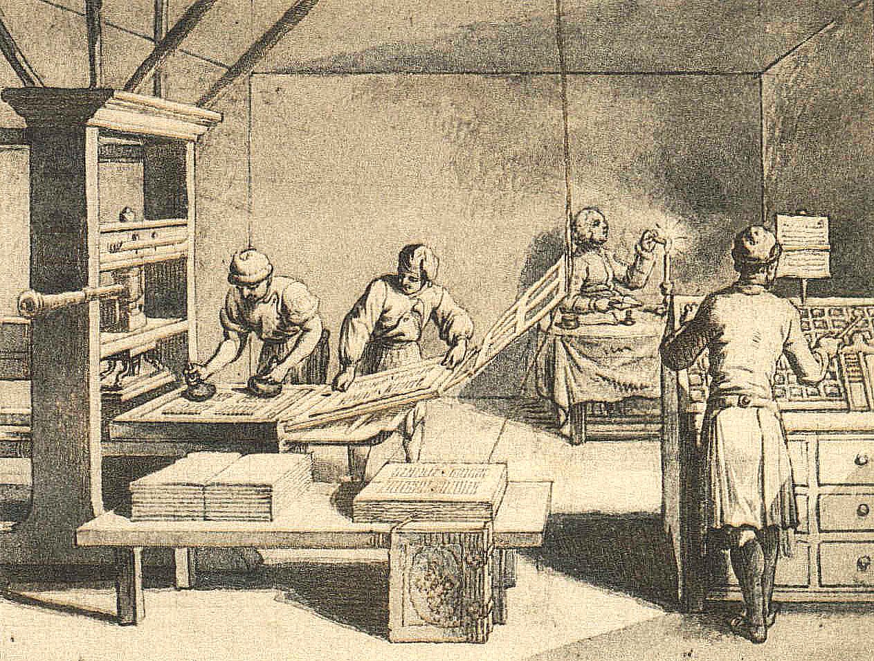
Photo: Daniel Nikolaus Chodowiecki, Public domain, via Wikimedia Commons